01.
F3GLOBAL /
REBUILDING A PUBLIC SITE AND CUSTOM ADMIN PORTAL FOR A GLOBAL MICROFINANCE NONPROFIT.
ROLE /
DESIGN LEAD
TIMELINE /
8 MOS
PROJECT TYPE /
WEBSITE & ADMIN PORTAL
TOOLS & SKILLS /
FIGMA, DESIGN SYSTEMS, USABILITY AUDITING, USER TESTING, RESPONSIVE DESIGN, AI-ASSISTED WORKFLOWS
TEAM /
3 DESIGNERS, 9 DEVELOPERS, 1 ENGINEERING MANAGER, 1 PROJECT MANAGER
Designing credibility for a microfinance nonprofit, resulting in a fully shipped, live platform.
F3 Global Foundation provides microloans and entrepreneur support to small businesses in underserved communities worldwide. The old website wasn't reaching any of the three groups the organization depends on, including donors who fund the loans, clients who receive them, and members who run programs. The site was also hosted in a way the organization couldn't easily afford or update.
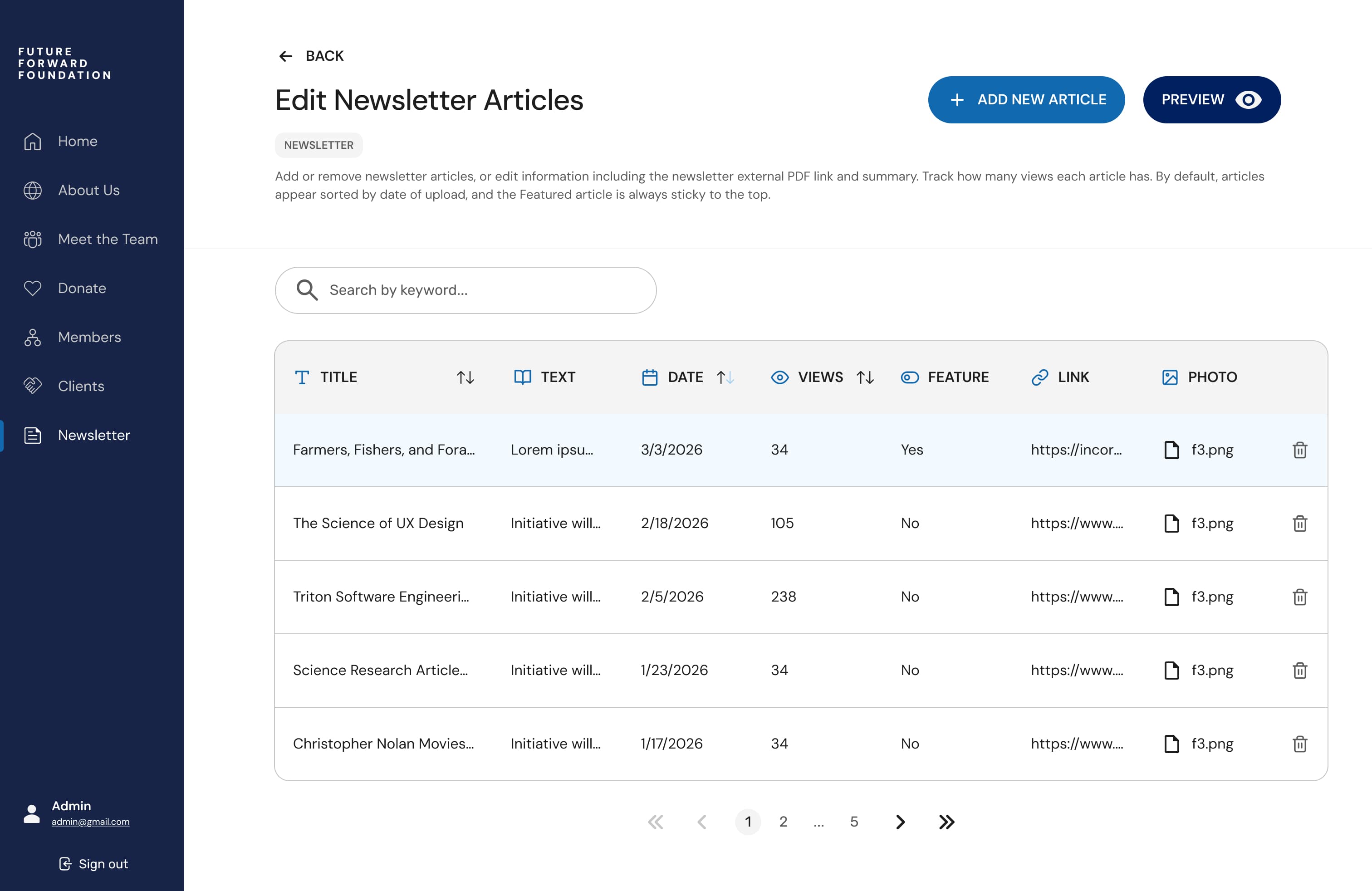
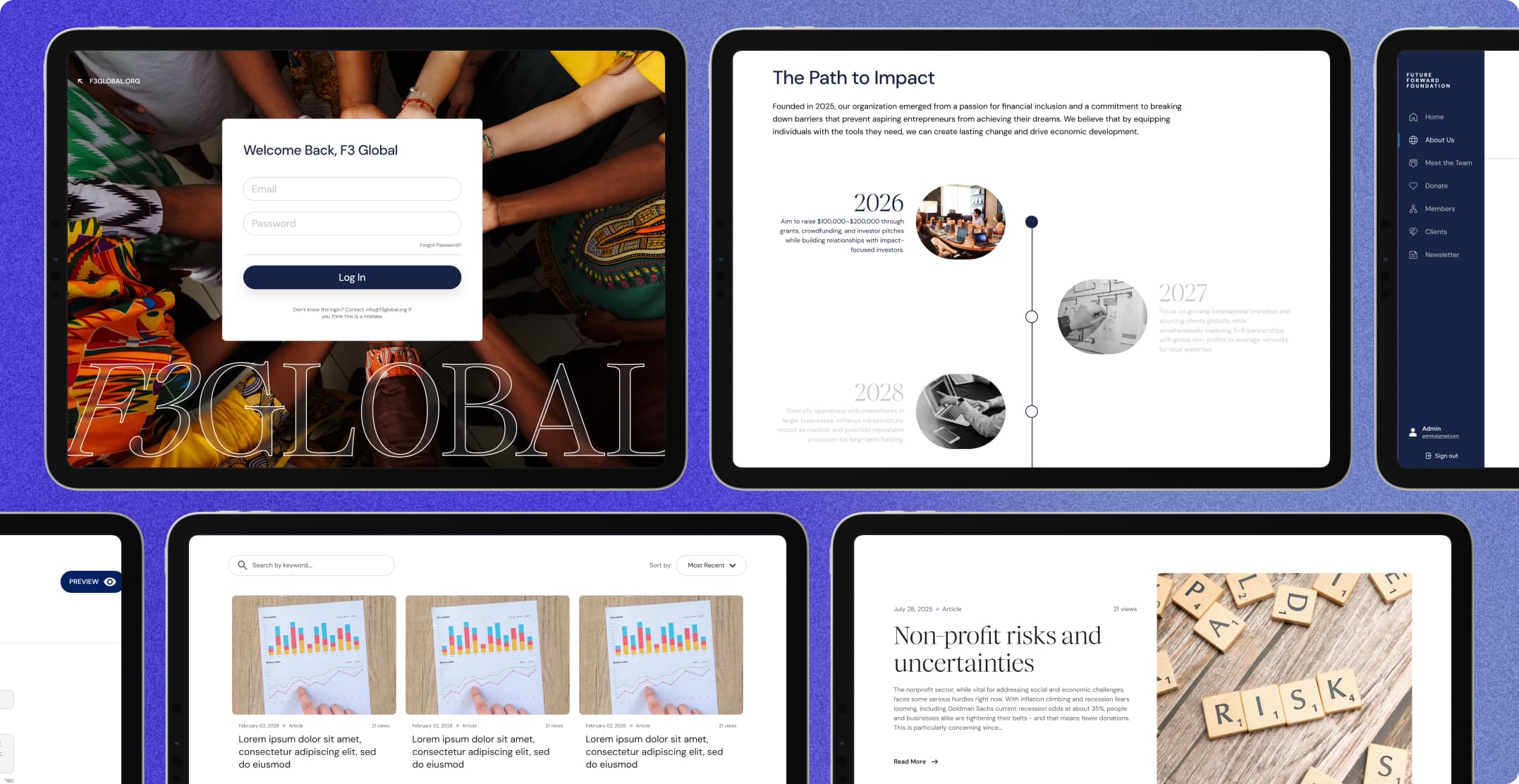
I led two other designers through a full redesign, handing off to and working alongside with a team of 9 developers. The deliverables included a public site, mobile and tablet breakpoints, and a custom admin portal so staff could maintain the content, newsletter system, and team member database.
OUR APPROACH
01
How might we rebuild a confusing legacy website that donors, clients, and members can each navigate to achieve distinct goals, paired with an intuitive backend admin portal?
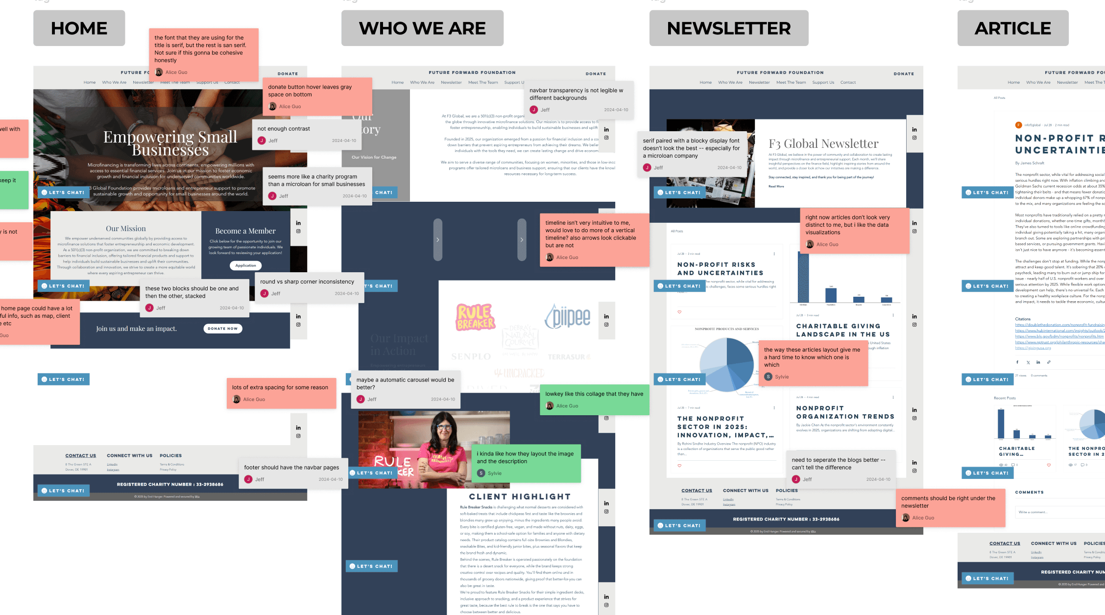
Before proposing anything new, we spent two weeks auditing the existing site and evaluating how similar organizations drove engagement and earned trust. From scratch, we then built a design system that nine developers could implement inside an eight-month timeline.
Usability Audit
We started by evaluating every screen of the legacy site. We discovered issues including a confusing information hierarchy, overly dense text, and a lack of clear purpose in the contact forms that left users lost. The site also faced accessibility problems, with colors that didn't clear contrast guidelines and broken responsiveness.
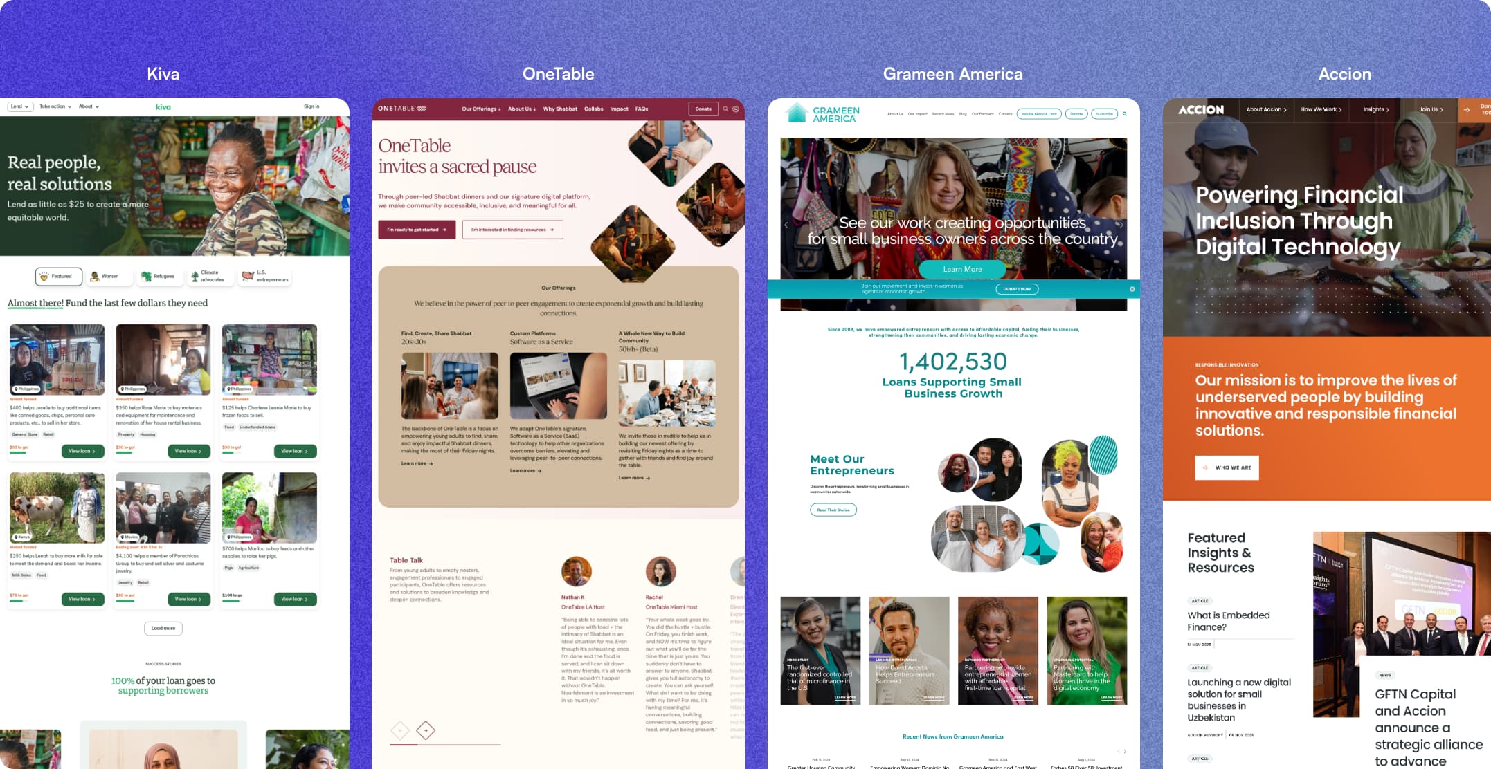
Competitive Analysis
We analyzed successful microfinance platforms like Kiva and Grameen America to understand industry standards for building trust. We realized our solution needed to build confidence for every visitor, using testimonials and measurable impact to show we put people we serve first.
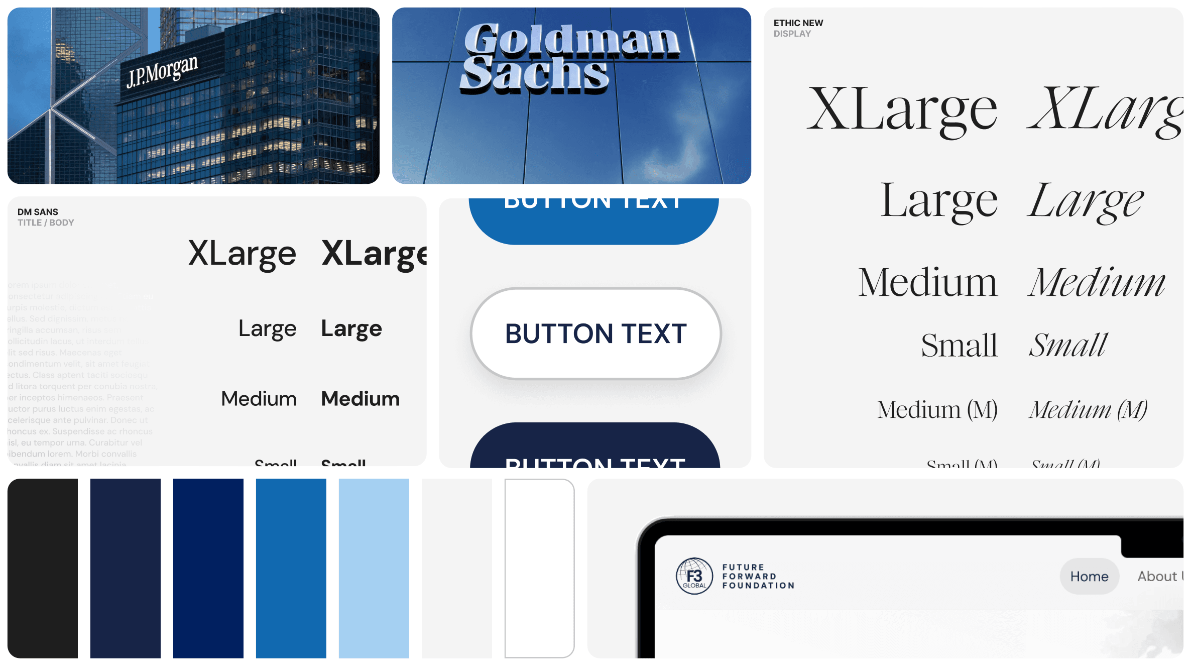
Design System
To craft an experience that felt credible and modern, we established a fresh, accessible design system. We used a cohesive color palette of blue shades and clean typography to build components that evoked a feeling of immediate trust.
DESIGN DECISIONS
02
Every screen went through several rounds of iterations before it was ready to ship. One decision about entry points reshaped the site's entire structure. Others shaped individual components, incorporating feedback from user testing, stakeholder review, and the developer team about what was feasible to build during the time we had
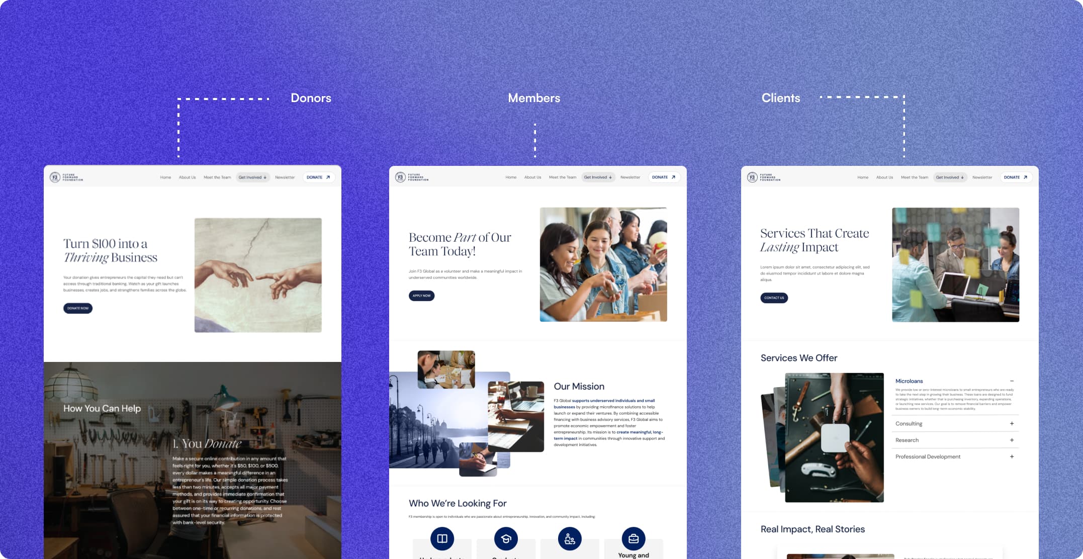
Three Entry Points for Three Audiences
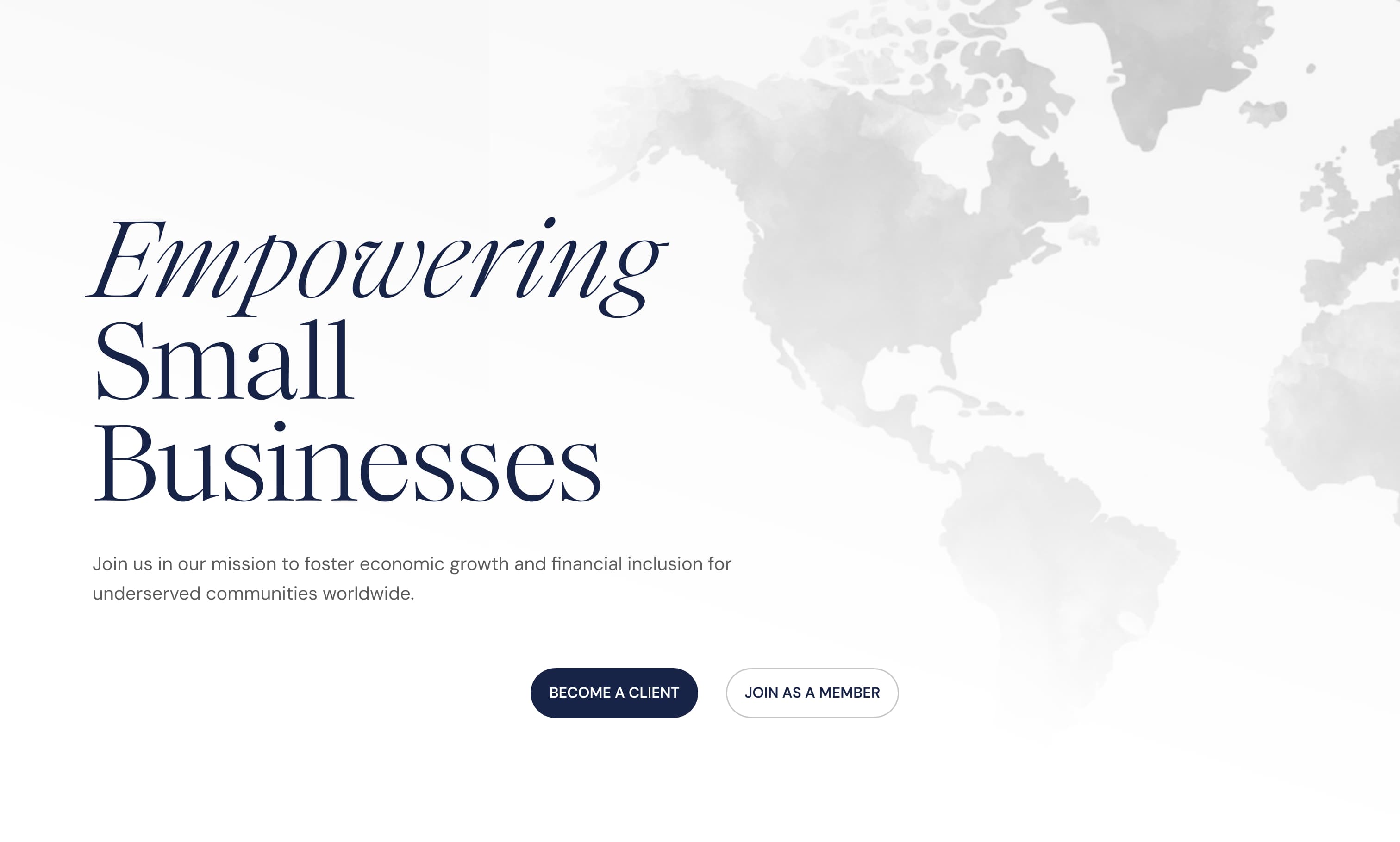
Donors, clients, and members came to the site for completely different reasons, but the previous site treated them as one audience. We rebuilt the homepage around three separate paths, each with its own entry point, language, and primary action which were to become a client, join as a member, or donate. Everything deeper in the site was organized underneath those three branches.
Pivoting the Admin Portal
The Mobile Sprint
Storytelling Through Design
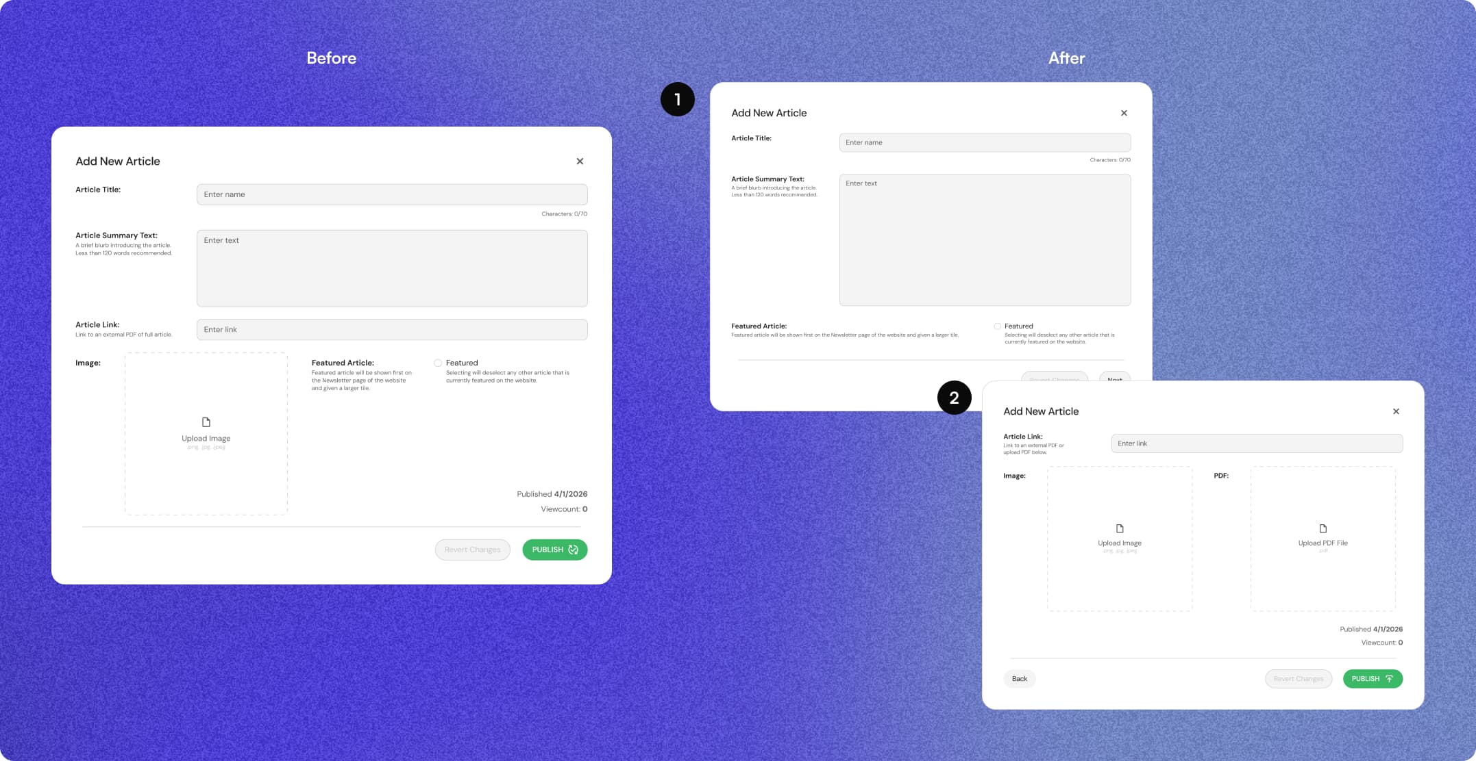
We initially designed the backend Newsletter Editor to fit everything needed for adding a new article into a single, large pop-up that filled the screen. User testing quickly revealed cognitive overload. We iterated and separated the flow into a two-step process, reducing information into digestible chunks.
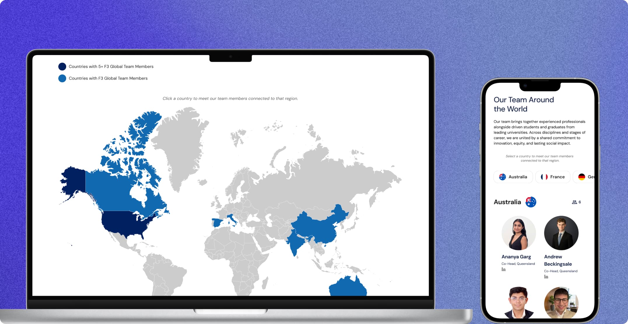
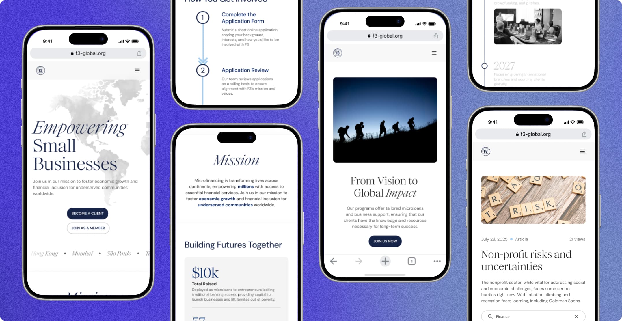
Our client mistakenly assumed mobile and tablet designs were included in the MVP handoff. We adapted immediately, grinding out the fully responsive mobile screens in just two weeks to meet the launch deadline. This was made possible through well-tokenized components in the initial build and buffer room I planned in our design schedule.
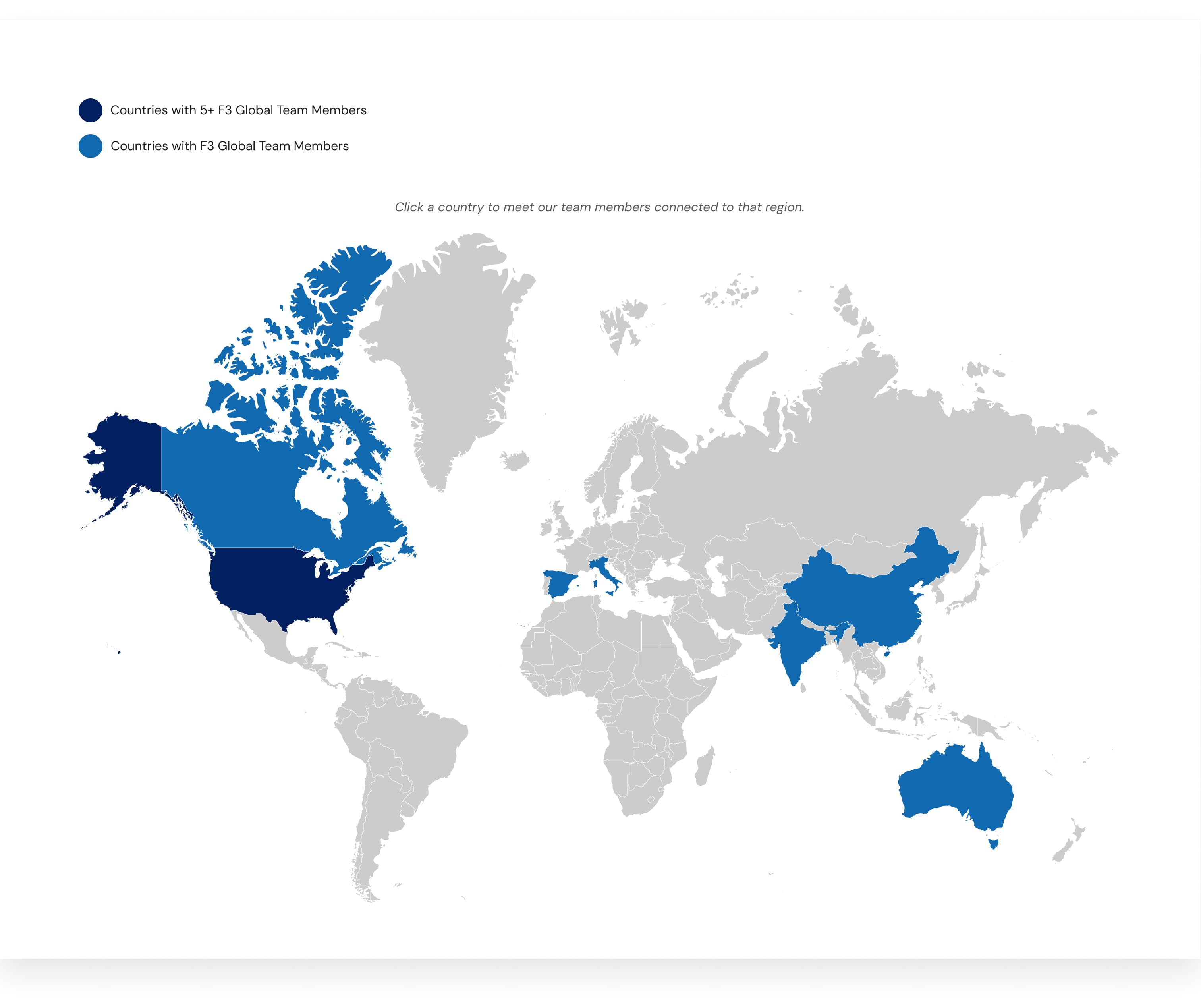
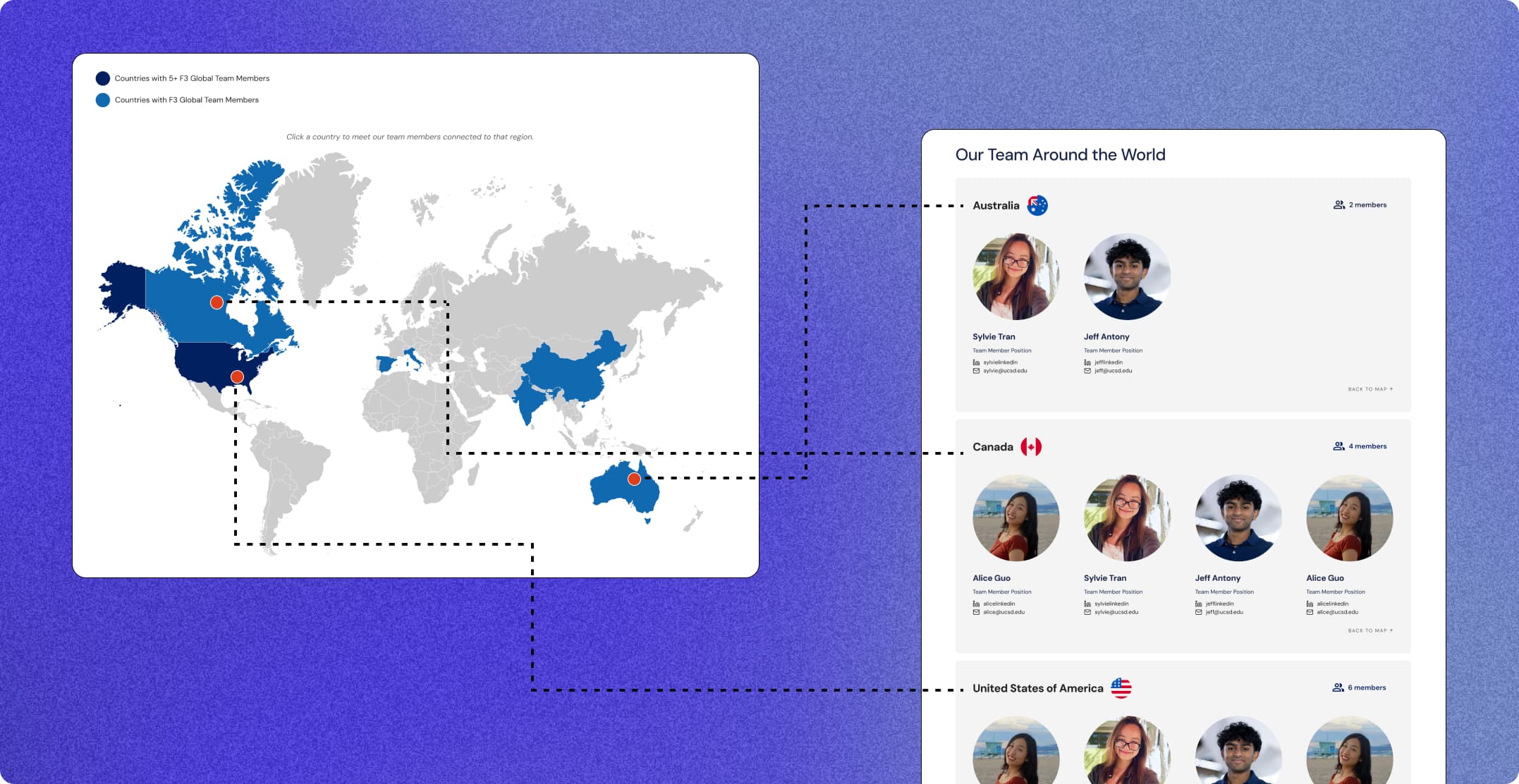
To drive donor engagement, we prioritized components proved the organization's real world impact rather than just telling it. We designed impact stories from past clients, an interactive global map showcasing F3Global's worldwide spread, and surfaced real, impactful numbers.
OUTCOME & IMPACT
03
High-fidelity screens delivered across desktop, tablet, and mobile.
Distinct audience paths, each with its own entry point.
Content types staff can now edit without a developer.
Usability test participants.
REFLECTIONS
04
The fully responsive website and custom admin portal are now shipped and live at f3-global.org. We are currently tracking metrics like click rates and bounce rates to quantify our success.
Takeaways
Responsiveness is more complex than scaling.
The work is only half done when everything is in high-fidelity on desktop. Making mobile designs and tablet adjustments required a whole different way of thinking, not just rescaling components. We delivered on time, but scheduling more space for responsiveness in the timeline would have given us more room to experiment and iterate.
Ask to see the content before designing the container.
We rebuilt the newsletter page after finding the content would be 20+ page articles, instead of the blog posts we assumed. Even though the rebuild was successful, it would have saved us time to ask what the content looked like beforehand instead of assuming. This has become an important lesson that's changed how I approach and run client meetings.
What's easy in Figma isn't easy to build.
Working closely with developers taught me to pressure-test technical feasibility early on in the process, so that handoff was smooth and everyone knew what to expect. We learned to think about our designs not only from a designer's perspective, but also consider how it may work in code.
Design for someone less fluent than you.
Our audience wasn't tech-savvy or design-literate, and neither were the staff maintaining the admin portal. Throughout the process, we had to remember to put ourselves in their shoes, and keep ourselves honest with user testing.
The Team
Huge thank you to Jeff Antony and Sylvie Tran for being two of the most talented, creative, and hardworking designers I could have asked to work with. To Weston Zong and Annabelle Guiditta, our Engineering Manager and Project Manager, thanks for leading the best TSE team with me.
And of course, so grateful to the incredible developers who made our designs come to life: Jaden Huang, James Escobedo, Katelyn Li, Munachi Okoro, Suhaan Khurana, Sweekrit Bhatnagar, Tony Wang, and Yasmin Kabir.